screen reader optimizations
posted on by Lee Cattarin

context
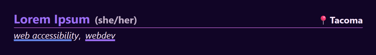
recently, I’ve been working on a website for a project called spoonfairies. On the providers page, we list a series of names along with their pronouns, location, and services offered. Visually, it looks like this:
pronouns
at first, all three pieces of information in the top row had no extra styling - it was just a line of text with the same color and size throughout. The location bit also didn’t exist yet, so we’re going to briefly ignore it. Screenreader testing (with NVDA, specifically) informed me that, when reading through a long list of providers, parentheses become very irritating. Imagine hearing the following:
Lorem Ipsum left parentheses she slash her right parentheses web accessiblity webdev. Dolor Sit left parentheses they slash them right parentheses housecleaning. Amet Consectetur left parentheses he slash him right parentheses webdev spreadsheets software.
…ad nauseam. Kinda irritating.
the fix
put the pronouns in a span that provides special styling, and use ::before and ::after to apply parentheses.
<a href="/providers/lorem-ipsum">
    Lorem Ipsum
    <span class="pronouns">she/her</span>
</a>
.pronouns::before {
    content: "(" / "";
}
.pronouns::after {
    content: ")" / "";
}
the slash is the magic there. The string before the slash indicates the visual content, and the string after the slash is the alternative text content. I went happily on my way.
plus, this is neat - now I can style the pronouns separately. Let’s make them the standard text color rather than the link color, and a bit smaller, and a smidge opaque… nice.
location
ooh, time to implement locations! I did my same ol’ trick.
<a href="/providers/lorem-ipsum">
    Lorem Ipsum
    <span class="pronouns">she/her</span>
    <span class="location">Tacoma</span>
</a>
.location::before {
    content: "📍" / "is based out of";
}
I even added actual alternative text rather than an empty string to provide some context. Pronouns, I figured, could exist without much context, as it’s pretty common for them to follow directly after names in introductions, but location isn’t as much of a given.
again, style em up nice, more of a standard text look, right-aligned. Cool.
a bigger problem than parentheses
…then I did some screen reader testing. Which I should have done directly after the pronouns bit. Turns out, I wasn’t thrilled with what the <span>s did.
at least with fairly default settings in NVDA, the <span>s broke up the way the link was read out. Suddenly, I was getting:
visited link Lorem Ipsum visited link she slash her visited link Tacoma
this is all one link, mind you. The <a> tag isn’t broken into three links. But the <span>s apparently break up the screen reader output anyway (in NVDA, that’s a continual caveat).
ooookay… what next?
total overhaul
I moved away from my content approach entirely (well, I kept it around as a failsafe, but it’s not running the show now). Instead, I switched over to an aria-label for the whole link.
<a href="/providers/lorem-ipsum"
    aria-label="Lorem Ipsum she/her is based out of Tacoma">
    Lorem Ipsum
    <span class="pronouns">she/her</span>
    <span class="location">Tacoma</span>
</a>
(technically, all this is templated to hell and back. I would hope that’s obvious given I’m talking about lists of these entries.)
now, after more screen reader testing, it reads out smoothly. The aria-label precludes the actual link text and cleanly says what needs to be said, with nothing breaking up the text and the whole thing easily recognized as one link. And I’ve got my fancy styling. Sweet.